04.04.23
THE ART OF THE FIGHT SCENE
The fight scene has been a staple since the beginning of cinema. From slapstick comedy to fantastical battles, Old West shootouts to gritty hand-held combat, fight scenes can encapsulate conflict in its simplest visual form and reveal story and character more directly than almost any other cinematic device.
In this article, we will take a deep dive into some of the most important visual techniques used to build a great fight scene, from the role of lensing and camera placement, to the relationship between camera and editing, and the fight scene oner.
We will break down a section of a fight scene from three films in this week’s crime movies drop. For each scene, we’ll show how these visual techniques were employed to create an iconic fight scene.
CAMERA PLACEMENT & LENSING
Case Study: TAKEN (2008) – The Final Fight
Camera angles, composition and lensing are among the most important tools for effectively staging and filming a great fight scene. They are the key to making the hits feel real, the action feel alive, and the fight feel believable to the audience.
While wide angle lenses can help accentuate the movement of characters and camera, long lenses can compress the space between figures in the frame and help sell punches and hits. Frontal shots can be better than profile shots for some types of hits, and vice-versa. And while a shallow depth of field can help disorient the audience and add to a sense of chaos, filming with a higher f-stop can help you see more of the action in the frame.
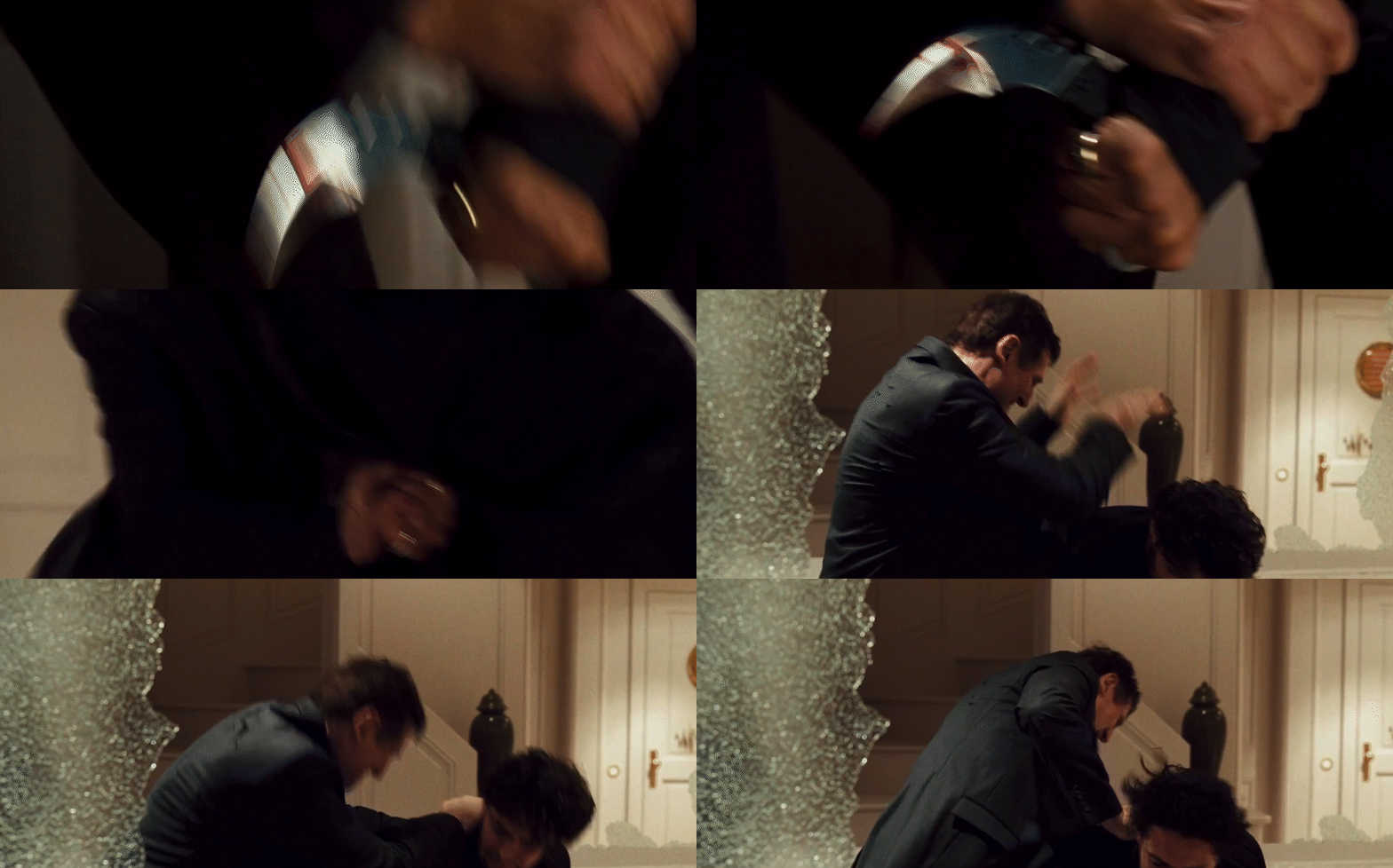
In the final fight scene of TAKEN (2008, dir. Pierre Morel), these tools are all used to heighten the stakes and the intensity of Bryan’s (Liam Neeson) situation. Cinematographer Michel Abramowicz largely builds the scene out of frenetic hand-held camera work that lives close to the action in order to bring the fight to life. Let’s step through how camera placement and lensing helped sell the action.
After Bryan crashes through the window and knocks the gun out of the villain’s hand, Morel and Abramowicz show the first punch. By starting with a medium-wide shot using a wider-angle lens, they are able to establish the relationship of the characters to each other (Bryan is on top) and to their environment (they are fighting in a closed-off space). The wide-angle lens with hand-held work also accentuates the horizontal movement of the characters through the frame.
For the blow itself, Morel and Abramowicz place the camera over Bryan’s shoulder using a longer lens. The angle of the camera helps compress the space between Bryan and the villain, so even when Neeson’s punch misses the other actor, it looks convincing. This, combined with the longer lens, accentuates the forward motion of the punch and makes it look like it has hit the other actor.
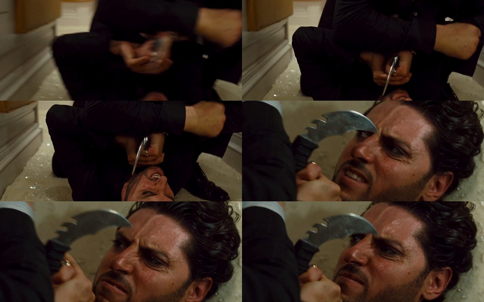
This pattern is repeated when the villain pulls the knife out. The medium-wide shot with a wider angle lens establishes where the characters are in relation to each other and the space…
While the closer shot with a longer lens helps sell the action. In this case, the knife is angled away from the actor’s face, and its motion is horizontal, so that if an accident occurs, it would miss the actor. But by placing the camera over Bryan’s shoulder and using longer lenses to compress the space between them, the audience buys that the knife is less than an inch from the villain’s face.
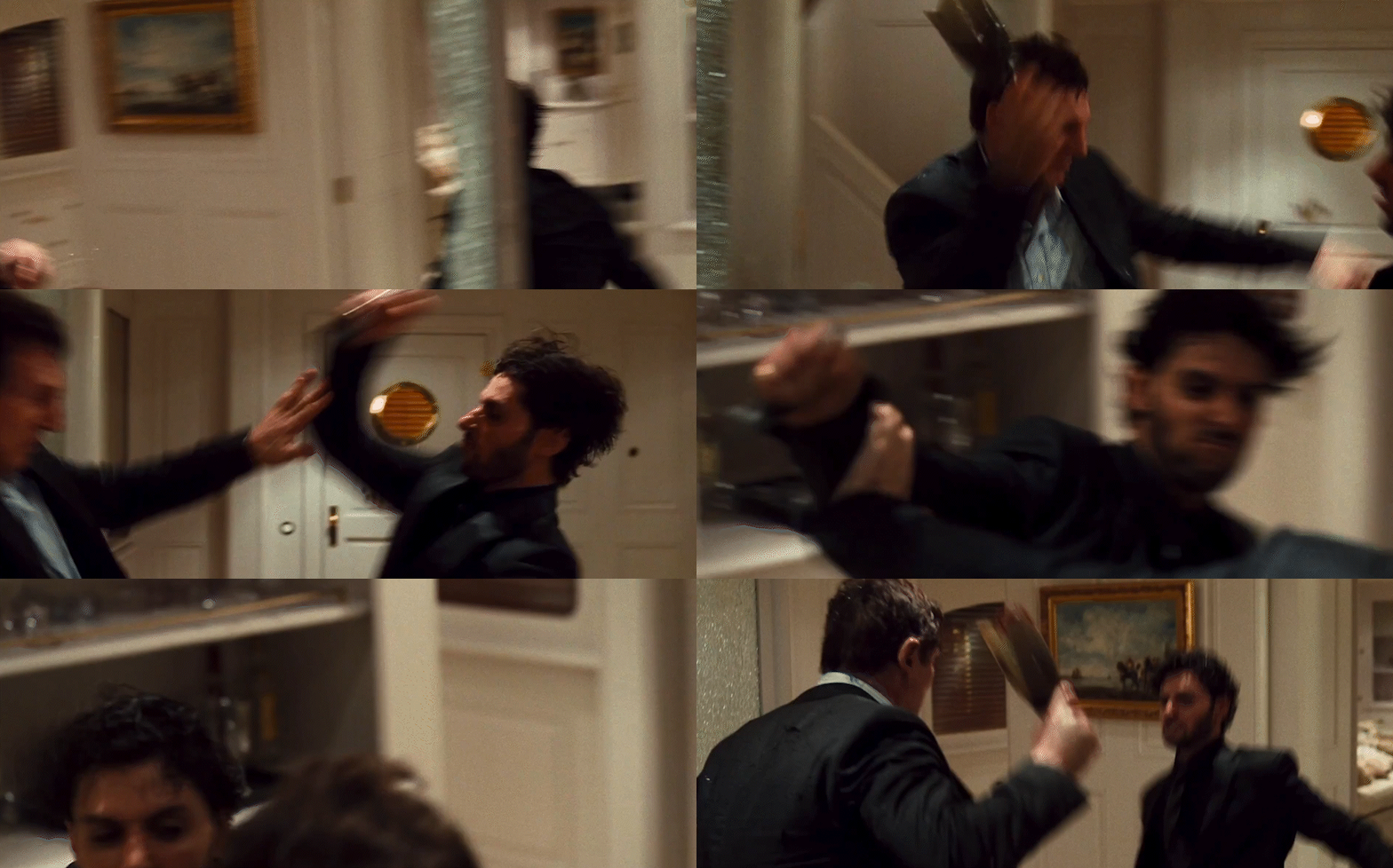
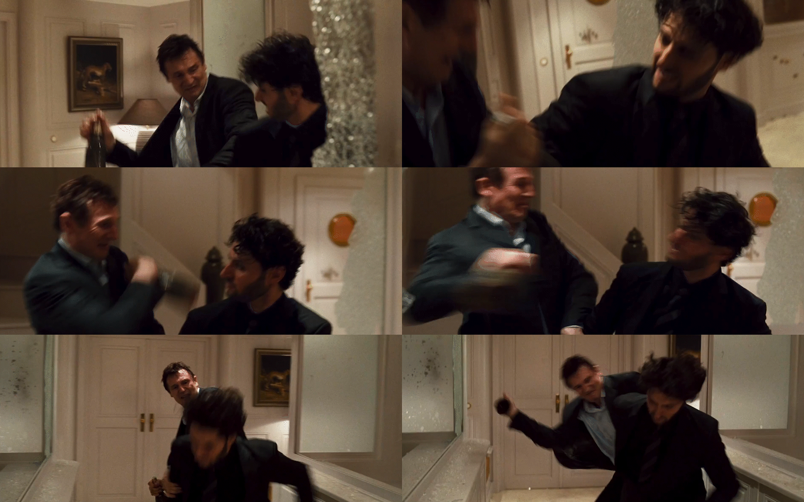
As the fight moves to the next room, Bryan is fighting with a smashed bottle against the villain’s knife. Morel and Abramowicz choose to photograph the fight in profile two-shots with wider-angle lenses. This choice has the same effect of establishing where the characters are in relationship to each other and their space, but it also helps to sell the action given that they are striking each other with hook punches.
By placing the camera in profile and having the actors hook punch from further away from the camera towards the camera, Morel and Abramowicz create another opportunity to sell hits without the actors needing to actually harm one another. The wide angle lens emphasizes the speed of the actors’ horizontal movement, and their blocking means that the strikes are convincing to the audience even when the actors are missing one another.
Insert shots are a critical tool to selling the action of any fight scene, especially when dealing with weapons in hand-to-hand combat. At the apex of the fight scene, Morel and Abramowicz tightly frame the knife using a wider-angle lens, allowing its horizontal movement through the frame to sell the action in the next shot.
By cutting on action to a shot using a longer lens, and by turning the characters slightly away from profile, Morel and Abramowicz can get away with the fact that Neeson is no longer holding a knife when his character “stabs” the villain. The reduced space between the characters, the clarity of the previous shot, and the swift upward tilt to the villain’s reaction all help sell the blow, and create a satisfying conclusion to the fight scene.
THE RELATIONSHIP BETWEEN CINEMATOGRAPHY & EDITING
Case Study: THE KILLER (1989) – Bar Shootout
Cinematography and editing have always had a symbiotic relationship in cinematic storytelling, and few places demonstrate the importance of that relationship more clearly than fight scenes.
Careful planning, pre-visualization and shooting for the edit are vital to filming fight scenes. They can help sell the authenticity of a moment, allow the audience to track the story of the fight, and heighten the drama.
Few filmmakers have brought more to the crime genre or the fight scene than Hong Kong master John Woo. His 1989 film THE KILLER, lensed by Peter Pau and Horace Wong, is an iconic staple of Hong Kong crime cinema. The film’s Bar shootout remains one of its most memorable fight scenes. Let’s look at how the relationship between cinematography and editing took the action of the scene to new emotional heights.
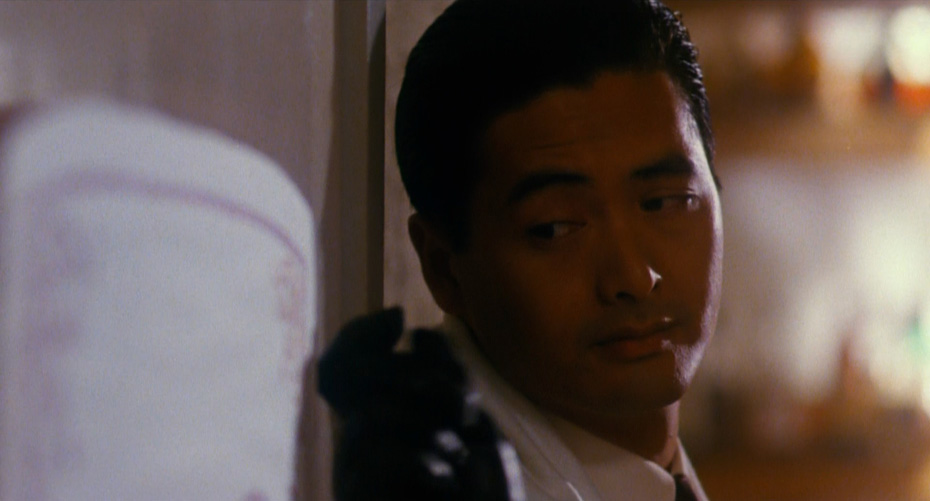
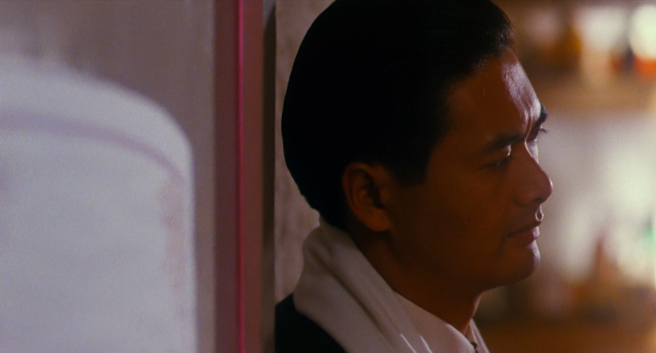
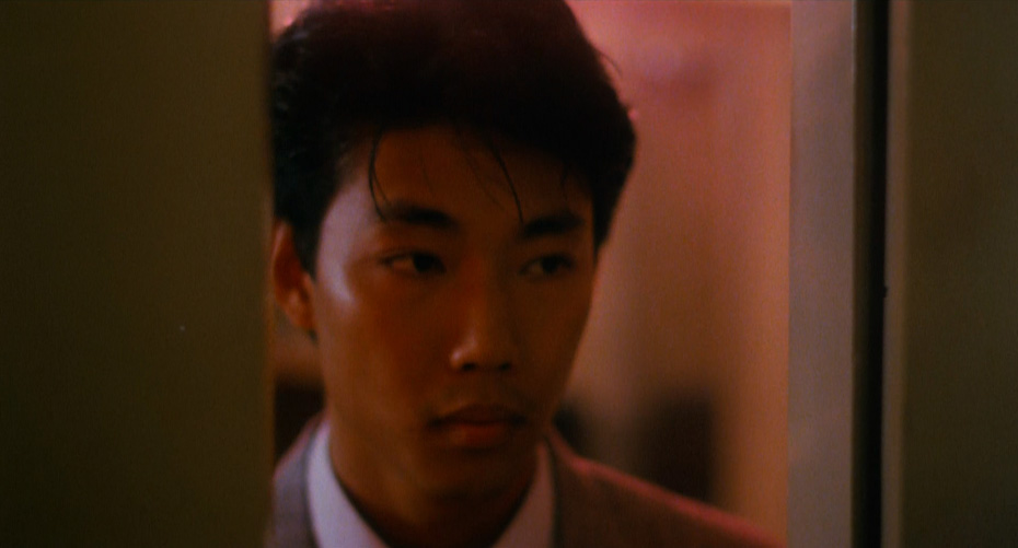
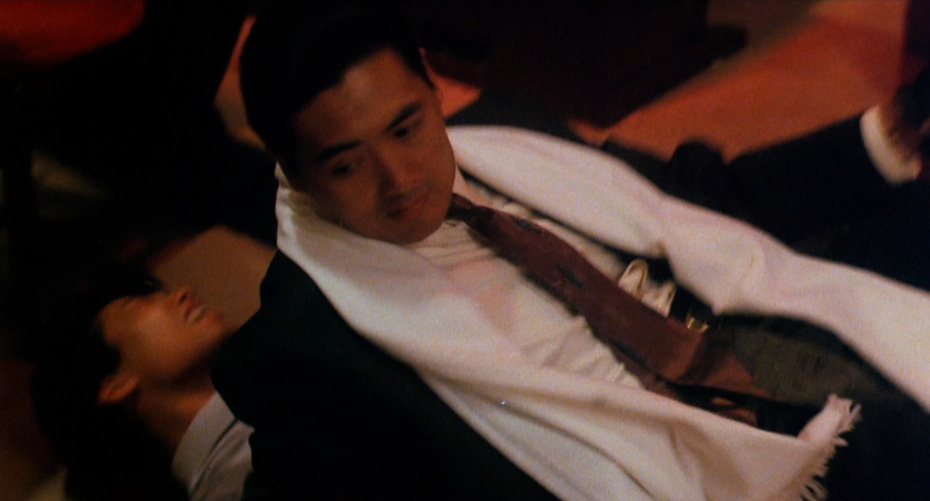
Three slow-motion, longer-lens close-up shots set up the stakes and key players of this sequence, isolating them from the rest of the scene and showing the audience who to follow.
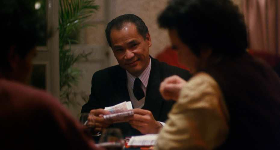
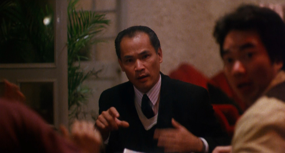
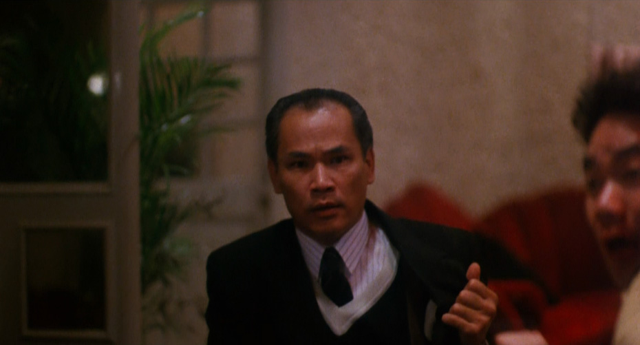
Shot 2: The mob boss, framed by two of his henchmen, reacts. This is our antagonist, and Ah Jong’s target.
Back to Shot 1: Ah Jong waits.
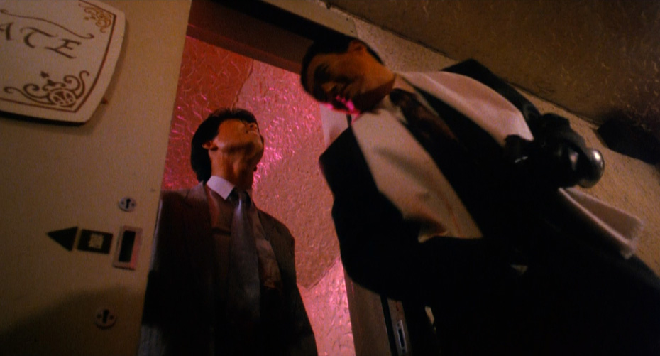
Shot 3: A henchman opens the door. He doesn’t know what’s coming, but the audience does…
Woo, Pau and Wong contrast this serene, slow-motion, long-lens visual language against wider-angle shots that are cut at blinding speed to throw the audience into the chaos of the shootout. But while the beginning of this fight scene might feel chaotic, the filmmakers don’t use as many shots as you might expect. The tight relationship between camera and editing allows them to throw us into the chaos, keep a track of the key players, and help us clearly follow the action as it evolves into the heat of the battle.
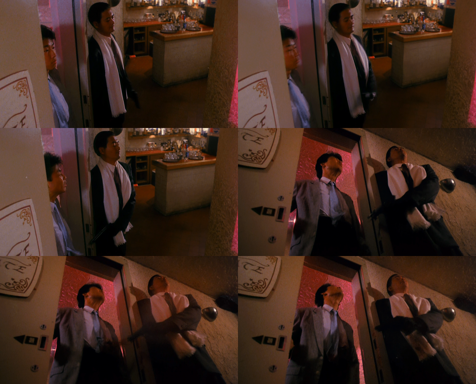
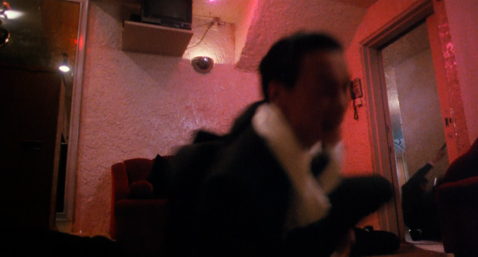
Shots 4 & 5: Two wide lens shots – one from a high angle, and the other from a low angle, are cut together in quick succession as Ah Jong shoots the first henchman. The cut and the difference in the camera’s position in each shot helps create movement even though the characters are relatively static. But while the opening longer-lens shots helped establish who our main characters were, these wider-lens shots establish where our main characters are. They help set the stakes for the fight scene to come. Shot 4 is at regular speed, while Shot 5 is in slow-motion, emphasizing the violence.
Back to Shot 2: The reaction of the mob boss is emotionally important to the trajectory of the scene. He wasn’t expecting Ah Jong to be here, and everything has changed now. The slow-motion helps emphasize this further.
Back to Shot 5: Ah Jong uses the henchman as a shield as he forces his way into the room. The slow-motion camera work takes on a new meaning at this point in the edit – our hero is crossing a threshold into the battle.
Back to Shot 2: As Ah Jong enters, the mob boss reaches for a gun.
Shot 6: The shift back to regular speed forces the audience to shift gears, as does the switch back to a wide-angle lens. The combination of these two changes helps create a greater sense of movement and dynamism in the frame as Ah Jong charges in.
Shot 7: Back to slow-motion, forcing the audience to shift gears again. This change of frame rates in such rapid succession means the audience is constantly accelerating and decelerating, and while each shot is mostly static, we feel as though we are in constant dynamic motion. Shot 7 is the reverse of Shot 6, and reveals new information – there are two more henchmen waiting near the door. Ah Jong is forced to swivel around and shoot them.
Shot 8: Back to regular speed, and the audience is forced to accelerate again. The shift in speeds emphasizes the speed and dynamism of Ah Jong’s movement as he falls back and shoots the two henchmen near the door.
Back to Shot 2: The mob boss has pulled out his gun, and the battle is now really on.
Shot 9: Ah Jong must swivel again to combat the mob boss. Notice that while the mob boss has been framed in the same long-lens, slow-motion shot through this entire portion of the scene, Ah Jong is constantly in new frames, and in motion.
Back to Shot 8: We see that all the henchmen near the door have been taken out as Ah Jong swivels to stand up.
Shot 10: Our widest-angle shot of the sequence so far. Woo, Pau and Wong help the audience understand the new space that Ah Jong is in, now that he has taken care of the henchmen at the door. We assume that the boss is off screen frame left, but we also see that Ah Jong has a new henchman to deal with as well. We see him pull out a second gun and shoot the henchman, and then the mob boss pops up into frame as the camera booms up, re-establishing both the geography and the emotional stakes of the scene.
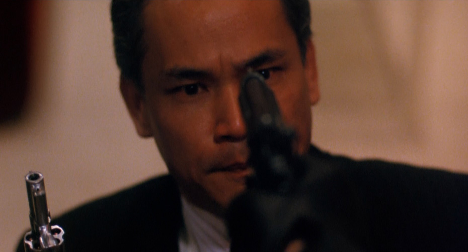
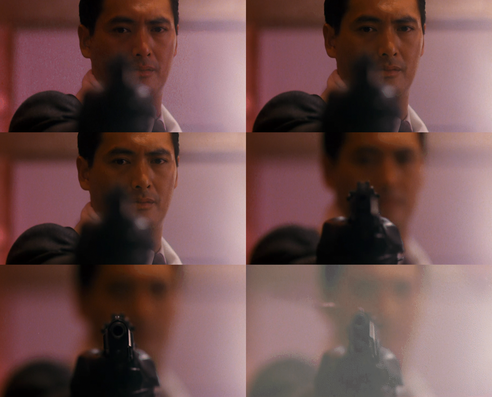
Shot 11: A long-lens close up shot of the gun in the mob boss’s face. Ah Jong has his man.
Shot 12: The most static shot of the entire sequence racks focus on the long lens from Ah Jong to the barrel of the gun. The audience is held in a moment of tension wondering what he will do, and the rack focus answers the question and throws us back into chaos.
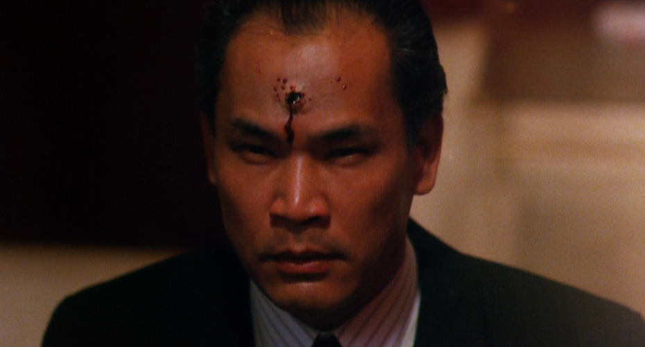
Shot 13: A cut on the gunshot to the close up of the mob boss being shot shows us that Ah Jong has killed the boss.
Shot 14: Ah Jong moves to shoot the boss with the second gun, emphasizing both the power he has through the low-angle framing of the shot, as well as the violence via his and the mob boss’s movement in the frame.
Shot 15: Woo, Pau and Wong return to slow-motion emphasizing the brutality of the moment as Ah Jong shoots the mob boss repeatedly.
Back to Shot 14: Ah Jong fires again.
Shot 16: A close-up over-the-shoulder slow motion shot of the mob boss being killed.
Shot 17: Slow motion, static shot of the mob boss hitting the floor. Ah Jong’s job is done.
Woo, Pau and Wong only use 17 shots in 25 seconds of this fight scene. While that might seem like a lot, compare it to the final fight scene from Taken, which uses 34 shots in its first 25 seconds. The Killer demonstrates that a chaotic high energy fight scene doesn’t necessarily need to have a blindingly fast speed of cutting. By understanding the relationship between camera placement/lensing and editing and using this relationship effectively to create dynamism, fight scenes can both feel like they are moving at breakneck speed while never losing track of who to follow and where they are in relation to each other.
THE FIGHT SCENE ONER
Case Study: ASH IS PUREST WHITE (2018) – Street Fight
The oner is one of the most effective techniques to bring the audience into the immediacy of the world of the film. When a fight is executed entirely in one shot, such as the iconic hallway fight in Oldboy (2003, dir. Park Chan-wook) or the explosive hospital sequence from Hard Boiled (1992, dir. John Woo), it can almost feel like the filmmakers are forcing the viewer to hold their breath. There is a sense of sustained tension as we instinctively anticipate the cut that never comes. In addition to this editorial tension, the oner is an effective way to make a fight seem real and physically grounded as the punches, stabs and gunshots can neither be buried nor given heightened emphasis through a well-timed cut. The viewer gets the feeling that they are watching a real moment unfold as it happened.
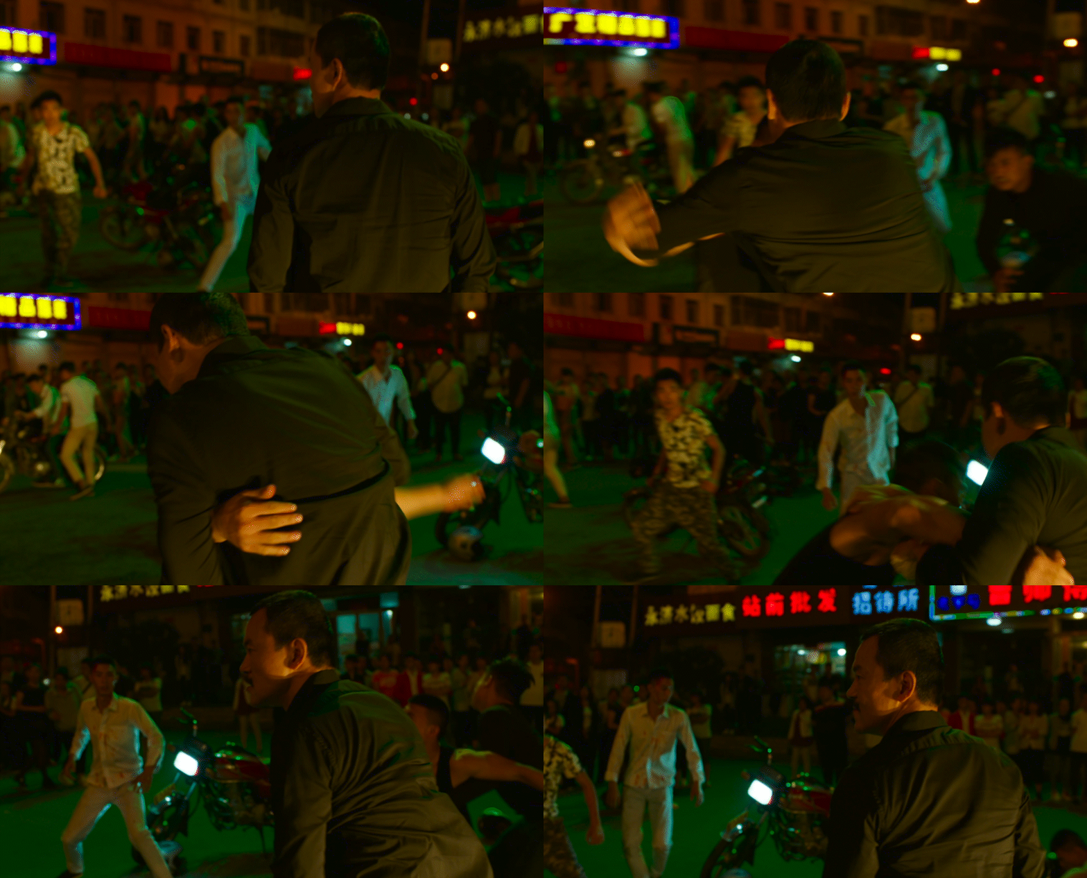
ASH IS PUREST WHITE (2018, dir. Jia Zhangke) makes use of two extended oners in the major fight scene that occurs towards the beginning of the film, one following Bin (Liao Fan) and the other following Qiao (Zhao Tao).
One of the most complicated elements of shooting a fight scene as a oner is making punches and hits look believable. Editing work has to be done in camera to ensure that the camera is in the right position to sell each hit, while also evolving the shot in an organic and visually interesting direction so that the audience remains engaged throughout without feeling a sense of visual or narrative slack.
Let’s look at how Zhangke and cinematographer Eric Gautier accomplished this with the first oner in this scene, where Bin exits the car to confront a band of gangsters on the street.
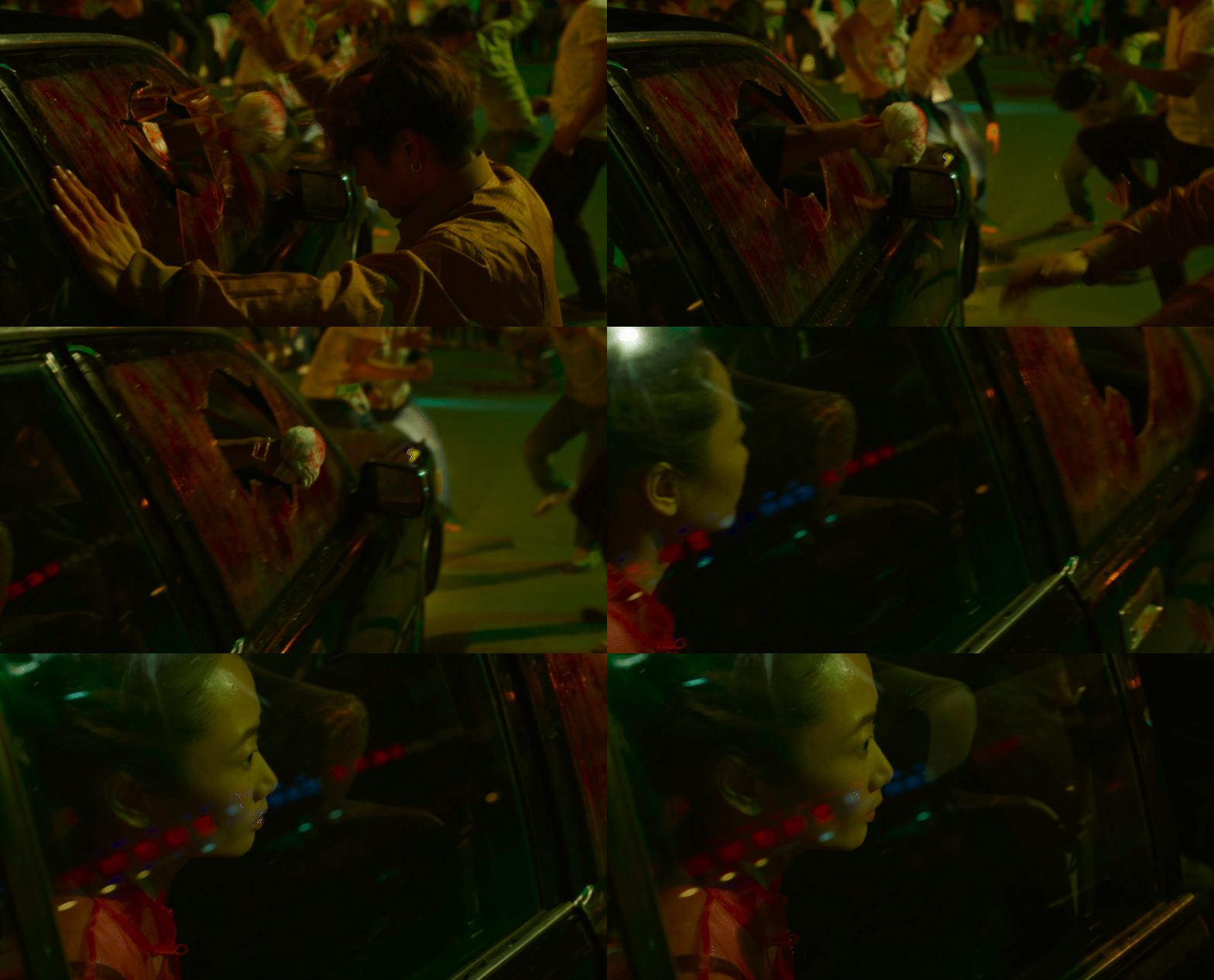
The oner opens on a hard cut of Bin’s fist smashing through the windscreen into the head of a gangster. The composition is formal and strong, placing emphasis on the violence of the action and on Bin’s strength.
As Bin gets out of the car, the camera pans to Qiao in a medium close-up, watching her partner take on the gangsters. The relationship between Bin and Qiao is the emotional bedrock of the film, and the audience is most directly aligned with Qiao’s perspective – we see action through her eyes.
Zhangke and Gautier shoot the oner hand-held with a medium focal length lens and a shallow depth of field. While the shallow DoF creates some disorientation and doesn’t allow us to see all the action in the frame, it also creates clear separation between subjects in the shot and gives the filmmakers and actors some room for error with the fight choreography.
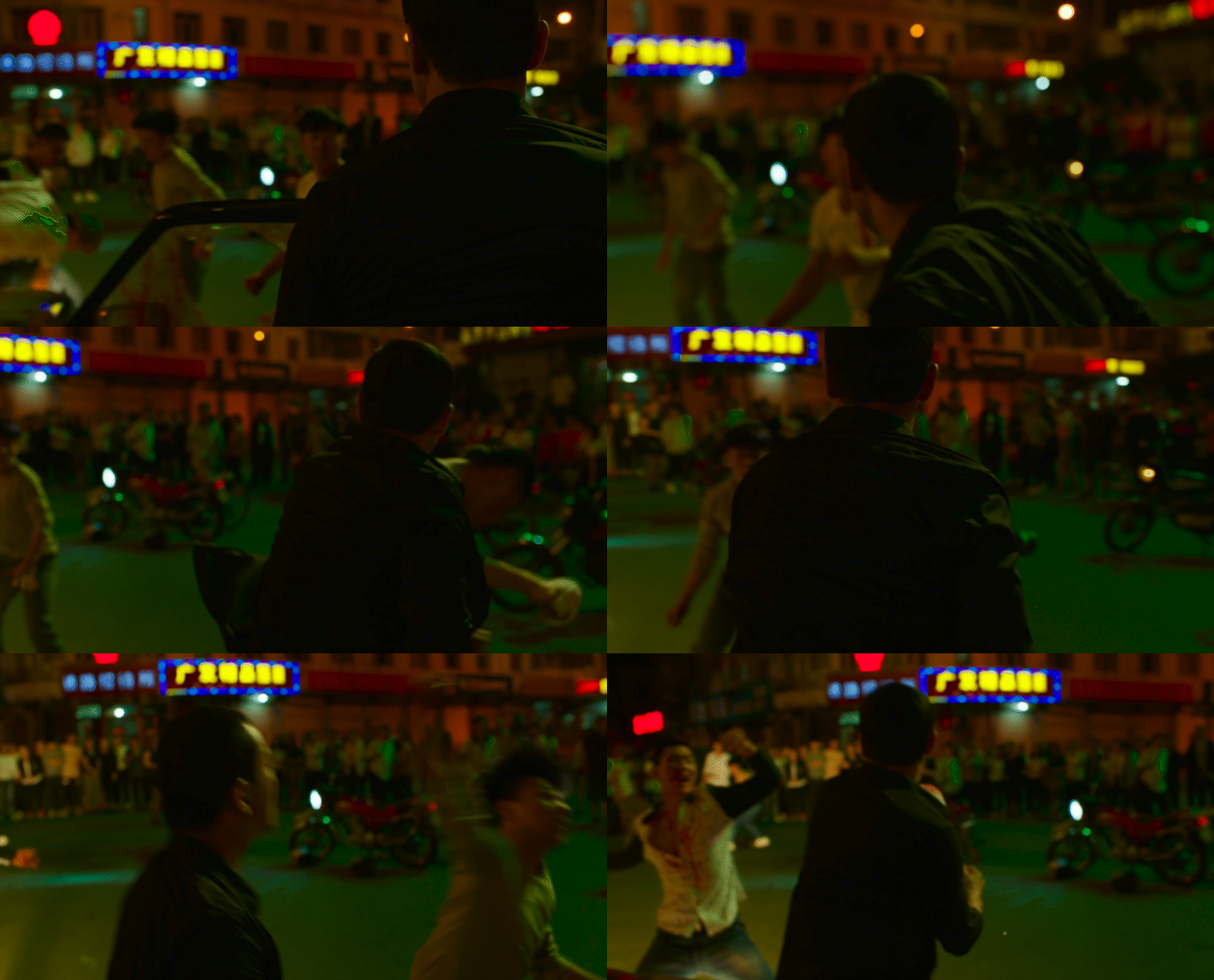
Zhangke and Gautier hold the camera behind Bin as he punches the gangster, allowing the hit to read convincingly.
As Bin spins to confront more gangsters, we see people forming in a crowd out of focus, heightening the tension of the shot and forcing the audience to ask how they will come to affect the action.
Zhangke and Gautier frame the hook punch in profile, helping to sell the hit. The hand-held camera work, the shallow depth-of-field and the framing that places the gangster at the very edge of the frame helps to sell this hit even more. Bin is framed dominantly in the shot – he is winning the fight.
The camera holds Bin as its subject throughout the oner, allowing the audience to be clear on who we are following even as the background evolves. As another gangster comes to fight Bin, we see even more people gathering in the background. The planning and choreography of the background extras helps to progress the narrative of a single shot and prevents the sequence from becoming repetitive.
As Bin backs up and the camera settles, we see the extent of both the crowd watching the fight, and the number of gangsters surrounding Bin. The power dynamics of the shot and of the fight have started to shift.
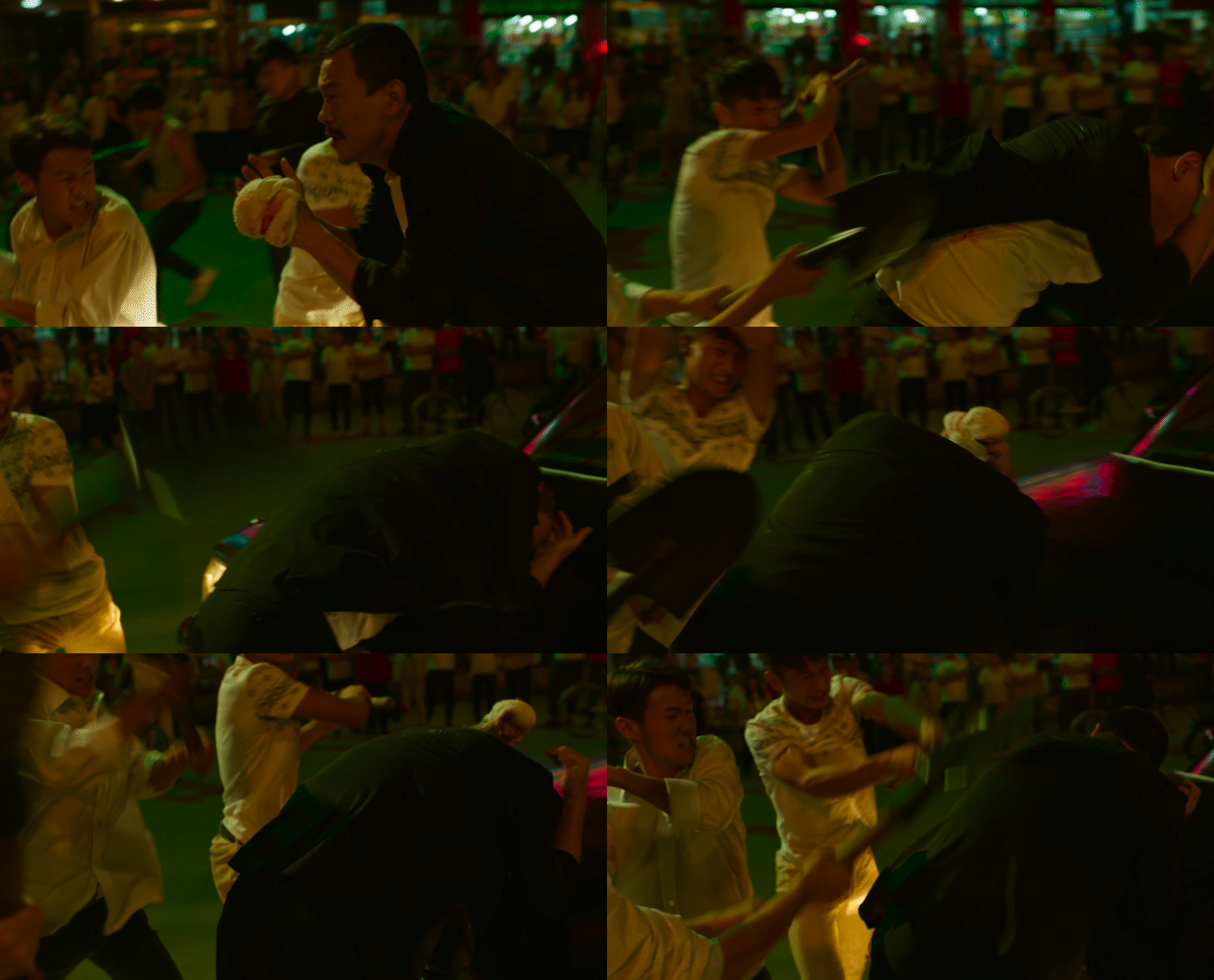
The framing shifts as the gangsters attack Bin with shovels and other weapons. Their lightly colored clothes and the high angle framing cast them as dominant over Bin, who is being slammed into the bottom right of the frame against the car.
As Bin’s head is slammed repeatedly into the car, the oner calls back to the image that opened the shot – a fist moving strongly from left to right. But now, one fist has become many, and our protagonist is the victim.
The camera pans off Bin for the second time in the shot. Once again, it pans to find Qiao, whose third party perspective we have been watching this fight through. The in-camera editorial decision of moving to Qiao enhances the viewer’s experience of the repeated head slams by moving them off the screen and into our imaginations, guided by sound alone. But it also calls back to the opening of the shot, and poses a new question: What will Qiao do? Teeing up the next section of the sequence where she becomes an active participant.
In each of these three scenes, the filmmakers use very different techniques to build suspense, heighten the action and sell the violence of the fight. As each example shows us, there is no one way to film a great fight scene. But by paying close attention to camera placement and lensing, understanding the relationship between cinematography and editing, and ensuring that each moment of a shot brings new storytelling value, each sequence crafts an impactful experience that sticks with the viewer for years to come.

