03.14.23
AN UNLIKELY PARTNERSHIP
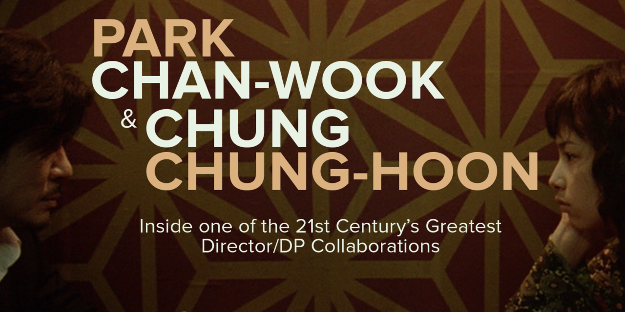
Few directors have made a bigger impact on 21st Century cinema than Park Chan-wook. The South Korean filmmaker, who originally planned on being a critic, has written and directed films and television shows across Korea, the United States and Great Britain, and is one of the most beloved and imitated Asian filmmakers of his generation. From mysteries to action thrillers, horror to romance and comedies, Park’s films have inspired filmmakers across the world and have all been marked by his idiosyncratic insight, humor and technical prowess.
By the time that Park broke out on the international stage with the 2000 film Joint Security Area, he had already directed two feature films – The Moon Is… the Sun’s Dream (1992) and Trio (1997). JSA, which follows an investigation into a fatal shooting incident at the DMZ, became South Korea’s highest-ever grossing film upon its release. The film has gone on to become one of the most influential Korean movies of the decade. Ever since, Park has become one of the most recognizable and celebrated filmmakers in the world.
Central to Park’s body of work is his collaboration with South Korean cinematographer Chung Chung-hoon. Chung was a former child actor who studied cinematography at Dongguk University. He began shooting his first feature film, Yuri, with director Yun-ho Yang in 1996. Chung had seen Park’s third film, Sympathy for Mr. Vengeance (2002), and was a fan of the director, but had very few credits to his name and no sense of a path to connect with him. However, a friend of Chung’s, Kim Sang-bum, who happened to be working with Park as his editor, recommended Chung to Park. Park called Chung to work on Oldboy without having seen any of his work. Chung has since recounted that Park later watched his earlier work and was unimpressed, speculating that his younger age relative to other Korean DP’s and Park’s trust in his editor helped him secure a job that he otherwise might not have gotten.
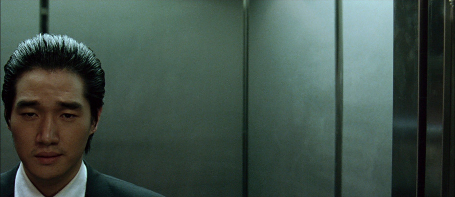
Chung’s collaboration with Park on Oldboy remains one of the most celebrated of recent history, and has led to five more films between the pair. What started as an unlikely partnership has yielded one of the most prolific and influential collaborations of its era. In this article, we will look at the trademarks of Park and Chung’s working relationship, and dive into the storytelling, visual and technical decisions that have defined each of their six collaborations.
HALLMARKS: HOW PARK AND CHUNG WORK TOGETHER
A SHARED IMAGE LIBRARY
Chung collects inspiration from images across various artistic mediums, including painting, film and photography. The genre elements at play in Park’s scripts are a touchstone for Chung to build a visual language. Films that work well and don’t work well within those genres are equally instructive to deciding what to do and not do in telling the story. Park and Chung have stated that they have an ongoing chain of text messages and emails with images they find inspirational. Some are directly relevant to the script, some are things to avoid, and many images are shared between them without explanation at all. Over time, they build and edit these images into a visual library that serves as the foundation for their visual strategy.
DETAILED STORYBOARDS
Like many of their Korean contemporaries, Chung and Park are strong believers in the storyboarding process. The pair have storyboarded close to the entire film prior to production on all of their projects. On their American film, Stoker, the speed of production necessitated by the studio meant their storyboards could not be as detailed as they would’ve otherwise made them. But on Korean movies such as Oldboy, the storyboards were so detailed that they ended up forming a detailed graphic novel of the film from start to finish.
Rather than creating a rigid shooting plan for production, Chung and Park see storyboarding as an opportunity to give them a foundation of experimentation. Chung stated in an interview with Eastern Kicks that the movies which have been closely storyboarded end up having around 40% of their shots altered during production anyway, but that there is much less room for flexibility and experimentation on set when you do not have a plan going into production.
MINIMIZING VFX
Before every production, Park, Chung and their effects supervisor have a meeting to discuss how they can minimize the amount of visual effects that end up in the final frame. Though VFX have been an important element of several of Park’s films, including I’m a Cyborg, But That’s Ok and Decision to Leave, he and Chung have always preferred an analog-first approach to filmmaking, using the tools of VFX in ways that are invisible rather than obvious.
CONTROLLING CONTRAST RATIOS THROUGH LIGHTING DESIGN
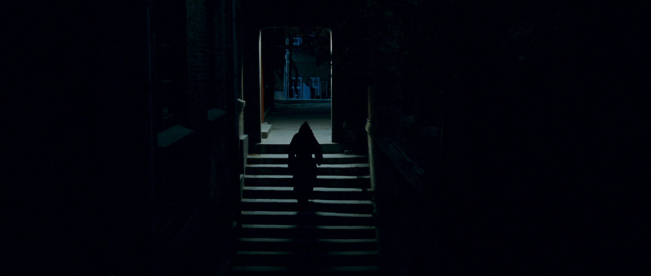
Park and Chung prefer creating mood and tone through lighting and contrast ratios on set rather than in post. The pair are proponents of the coloring process and Chung lights sets to ensure that Park has maximum latitude to fine-tune color in post-production. As a result, careful attention is paid to the contrast ratios of all areas of the frame while on set, and Chung avoids letting any areas of the frame go totally dark during production. Chung uses small lamps and sources to ensure that even the darkest areas of the frame allow for a small eyelight or for some latitude to move during the coloring process, keeping a close eye on their relationship to the brightest areas of the frame.
BUILDING A VISUAL LANGUAGE OUT OF CHARACTER FIRST
As a former child actor, Chung told Eastern Kicks that he feels his differentiating factor is his understanding and appreciation of a character’s point of view in a story, more than his technical knowledge or ability. His and Park’s pre-production and storyboarding work is deeply rooted in conveying the emotional perspective of the key characters in the story, with technical decisions usually coming afterwards. We can see the way that those decisions have born out in each of their six films below.
OLDBOY (2003)
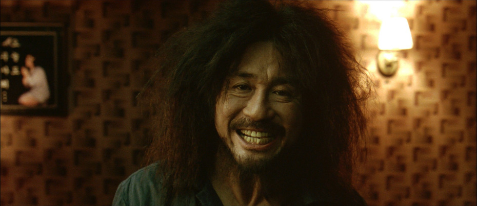
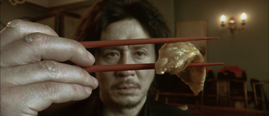
OLDBOY felt like a chase movie to Park and Chung. The pair were interested in the relentlessness of Oh Dae-su’s motivation for revenge, and wanted to create a heightened world that conveyed this state of mind. This mattered more to them than making homages to the manga that the film was inspired by, or presenting the visual hallmarks of the genre. Park and Chung tried to convey the protagonists’ sense of constant movement by relying predominantly on longer prime lenses and zoom lenses and building a visual style with lots of shots from behind characters as well as fluid camerawork that was rarely handheld.
It was also important to both that they develop the violence of the film in the imagination of the audience rather than placing it entirely on screen. The pair were judicious in what violence to show, and when, composing frames that allowed for violence to occur either just off-screen, between cuts, or entirely in the mind’s eye of the viewer.
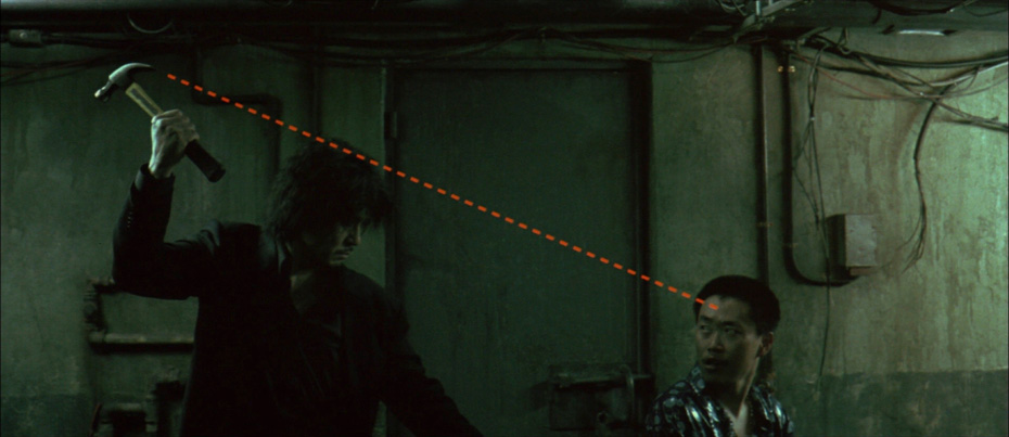
Oldboy’s most famous sequence is the hallway fight scene. The scene was a moment of heightened reality that Park and Chung wanted to feel almost like a side-scrolling video game, and was filmed entirely in a single take without any edits. The shot was filmed in 17 takes over 3 days, brutally conveying the dogged determination of Oh Dae-su with careful choreography and coordination between performers and camera. The only VFX element was the knife in Oh Dae-su’s back, an invisible piece of CGI there solely to serve the action and character rather than draw attention to itself as an effect.
SYMPATHY FOR LADY VENGEANCE (2005)
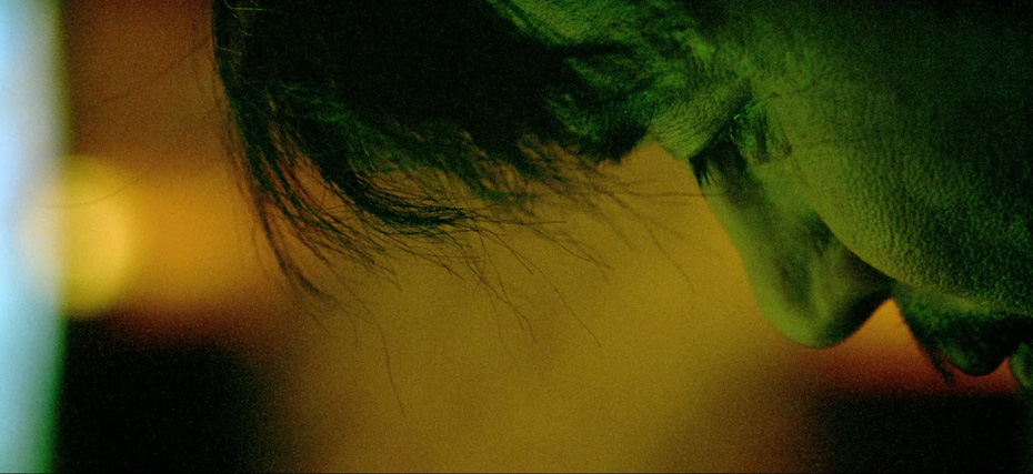
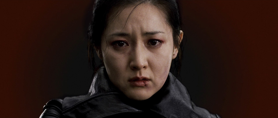
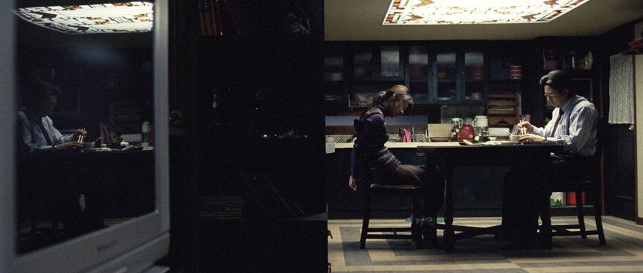
In SYMPATHY FOR LADY VENGEANCE, Park wanted to accomplish several things simultaneously through the cinematography. First, he wanted to show the futility of revenge by alienating the audience from the protagonist visually, creating a sense of isolation so profound that in the end, the protagonist herself becomes an observer rather than getting the emotional satisfaction of revenge. Secondly, he wanted to upend the audience’s expectations of both the genre and the lead actress by drawing them in through the cliches of revenge films and upend them by stripping them bare.
Color played a crucial role in Chung’s cinematography to bring this treatise on revenge to the screen. He and Park created an alternate version of the film called “Fade to Black and White” in which the color slowly desaturates over the course of the film until the ending is in black-and-white. But even in the widely-released version of the film, the pair paid close attention to lighting and color design, deliberately desaturating wardrobe, lighting schemes and other elements to drain the film of its visual exuberance by the time the revenge itself was enacted.
I’M A CYBORG, BUT THAT’S OK (2006)
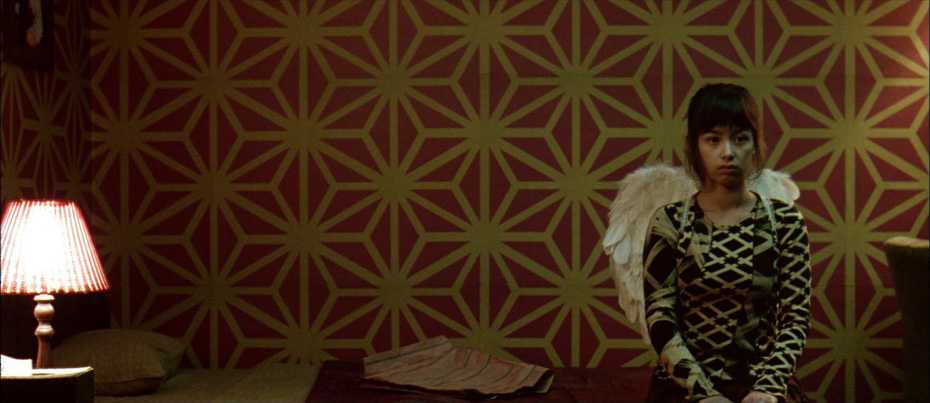
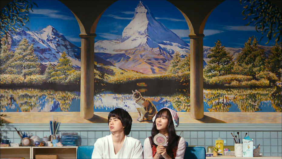
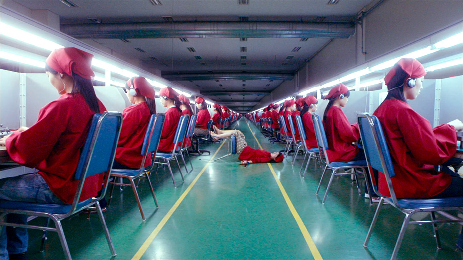
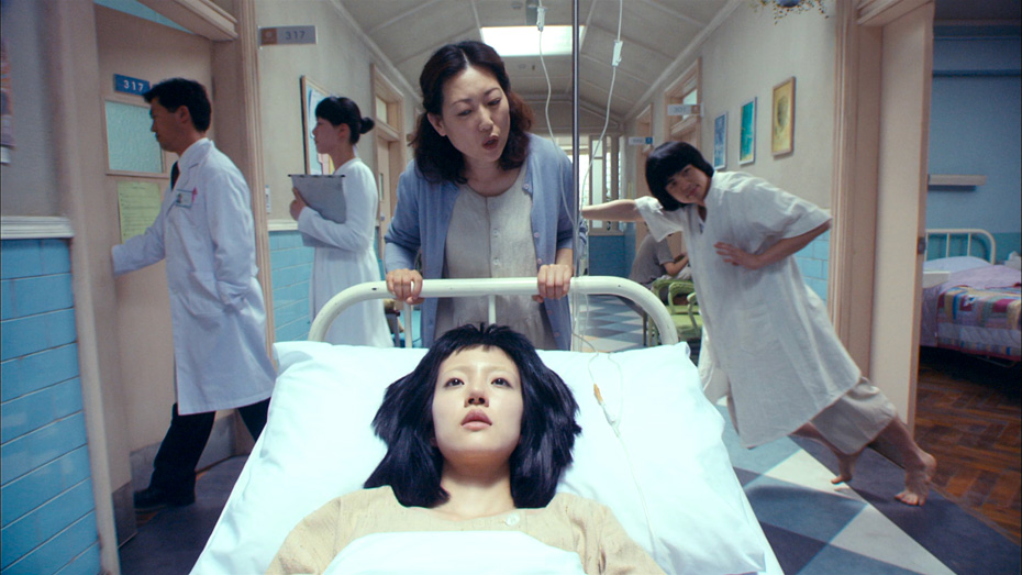
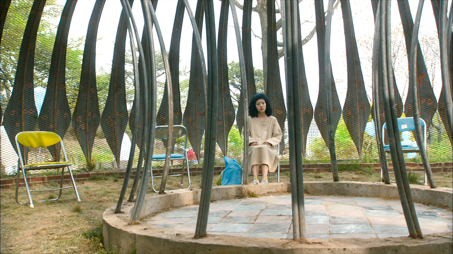
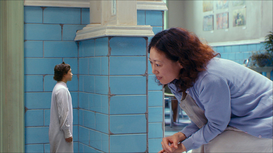
After directing his Revenge trilogy and a short film about similar subject matter, Park wanted to make a romantic comedy with a noticeable shift in visual and emotional tone from his previous work. He and Chung set out to continue their idiosyncratic visual style with an expressive, colorful film that embraced strangeness in its story as well as its visual presentation.
Chung and Park embraced visual effects to tell the story, aiming to convey as much as possible in camera and then supplement with CGI to not break the authenticity of the image, however surreal it became. The pair were influenced by the pop surrealism of anime films, and sought to bring light-heartedness to a world not usually treated with joy or comedy. I’m a Cyborg, But That’s Ok was shot almost entirely on sound stages, affording Park and Chung maximum control of their environments and camera language to push the film’s visual languages to its surrealist heights.
THIRST (2009)
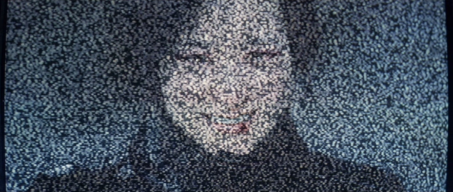
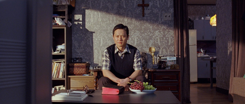
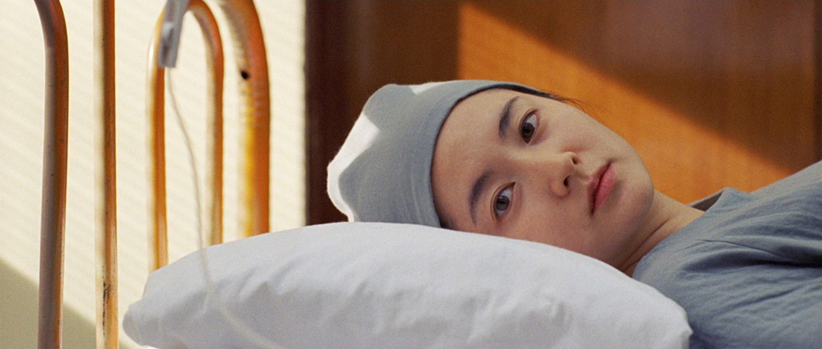
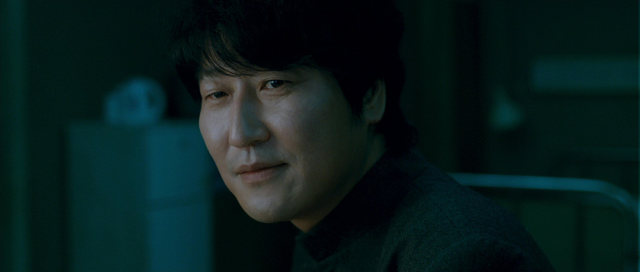
Despite the heightened nature of telling a vampire story, for Park and Chung, THIRST remained first and foremost a love story. Chung wanted the cinematography to reflect the human story of people misjudging one another, and couch that visual language within the broader expectations of the genre.
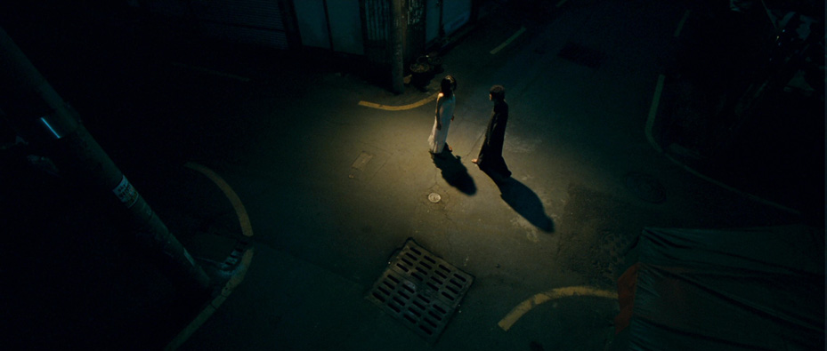
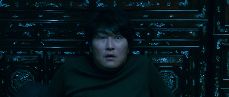
Chung and Park worked closely with Production Designer Ryu Seong-hie to design clashing spaces for Sang-hyun and Tae-ju. This would demonstrate the differences between their make-up as characters, as well as clue the audience into the emotional progression of the story. It was important for Chung and Park to contrast the light-filled opening of the film against the dark places it eventually went to. They created a lighting design that would evolve with the film, often mixing green with tungsten lights to heighten the clashing color schemes. Chung also shot with wider angle lenses than in his and Park’s past collaborations, creating frames in which actors had greater freedom of movement, and audiences could have a more tethered relationship with the characters and their worlds.
STOKER (2013)
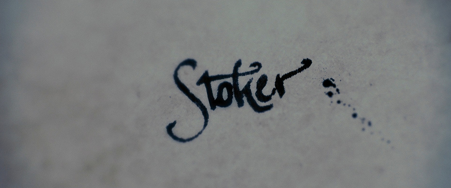
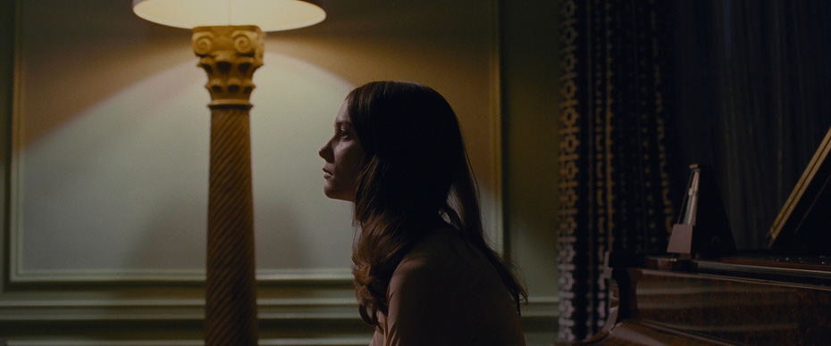
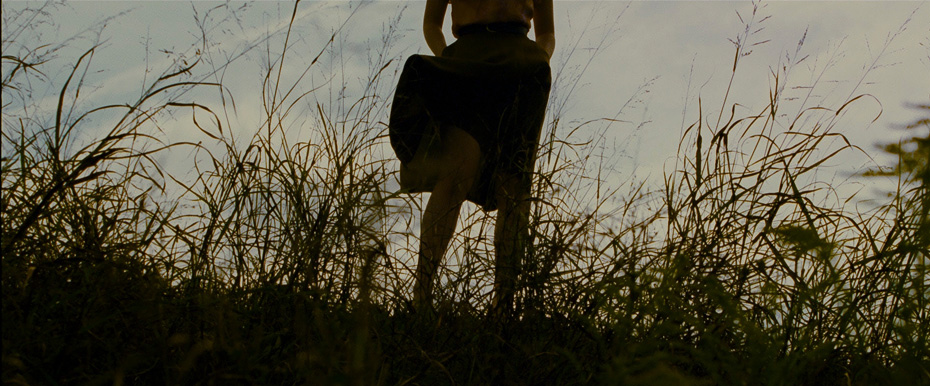
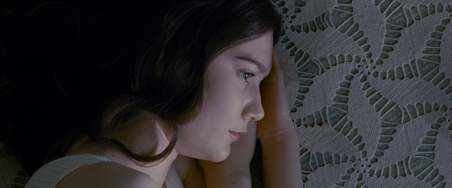
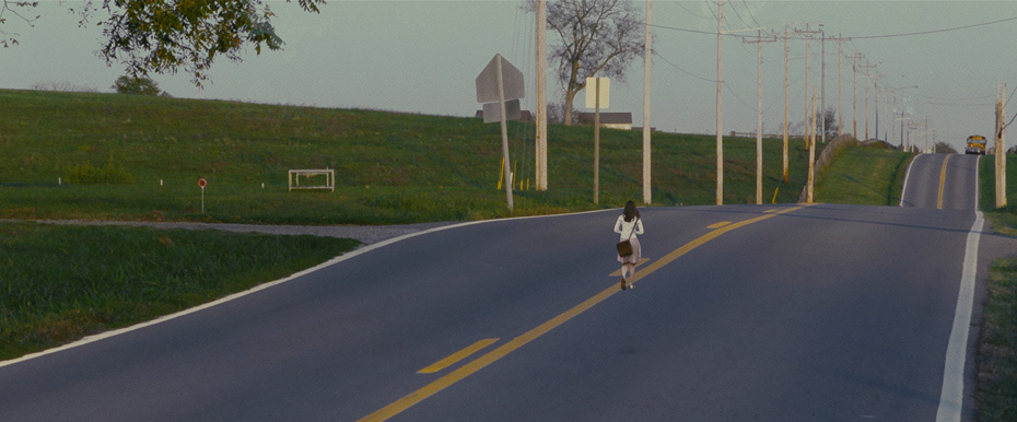
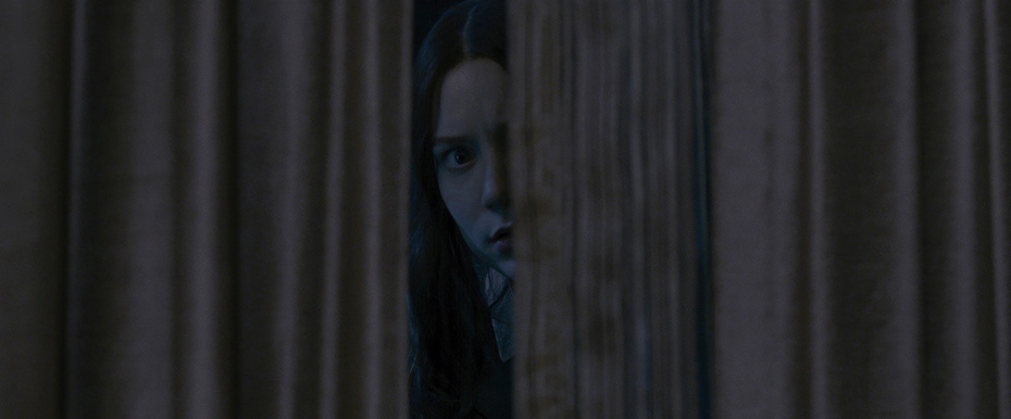
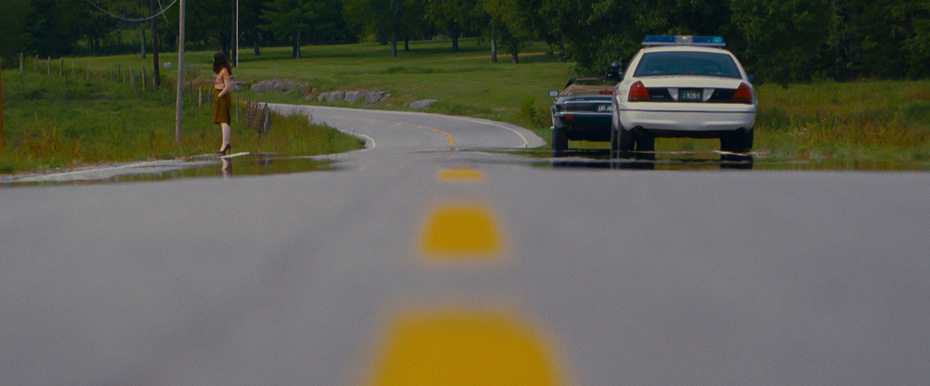
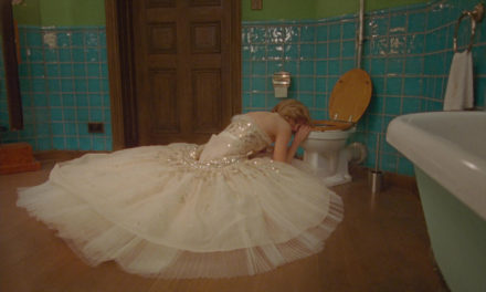
STOKER was an exercise in using cinematography and design to bring the danger of the characters’ world to the audience. Park and Chung chose to shoot the film close and intimate to the actors, creating an intensity to the frames that pushed the feeling of anxiety in the story. Visual geometry and use of strong angles became a core component of Chung’s framing strategy. Hallways, doors, patterns and even table edges were used as compositional elements to create unexpected frames within frames that challenged the audience’s expectations of typical coverage.
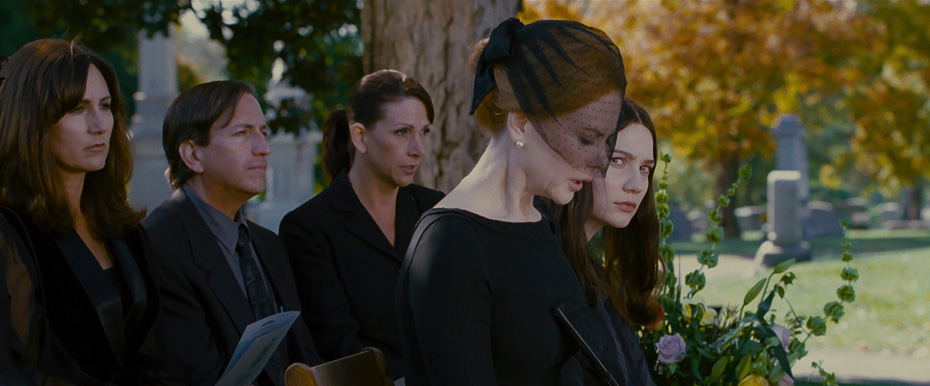
Color was an equally crucial element to the visual storytelling of the film. Red, so often associated with danger, had a clear metaphoric meaning that Chung and Park wanted to seed throughout the film. Park and Chung worked closely with the production design, lighting, costuming and hair and makeup teams to ensure that red was used in precisely the right moments of the film – down to Park specifying the exact shade that Nicole Kidman’s hair had to be from scene to scene.
THE HANDMAIDEN (2016)
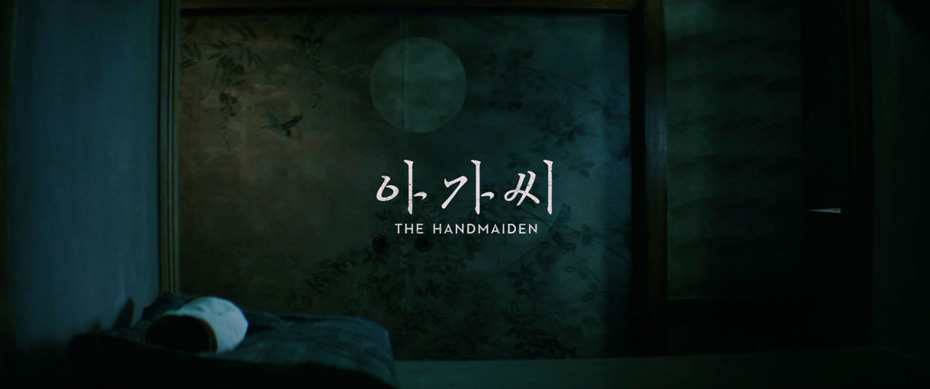
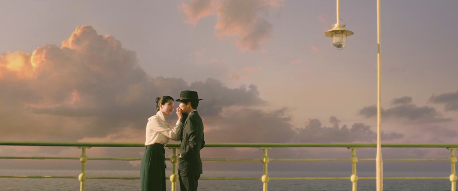
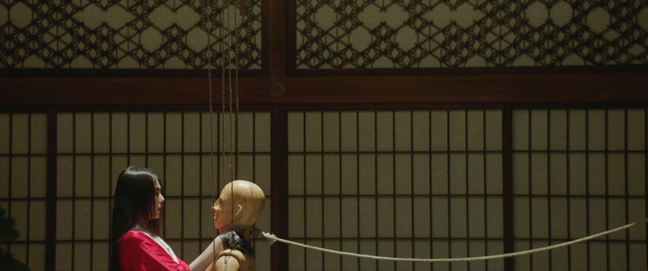
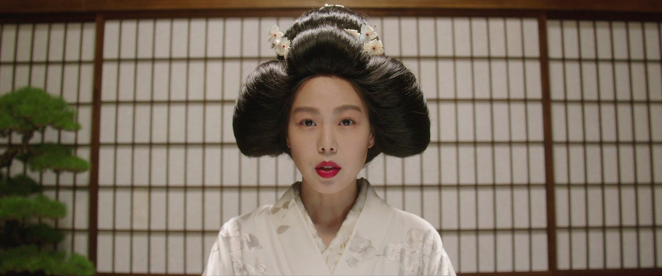
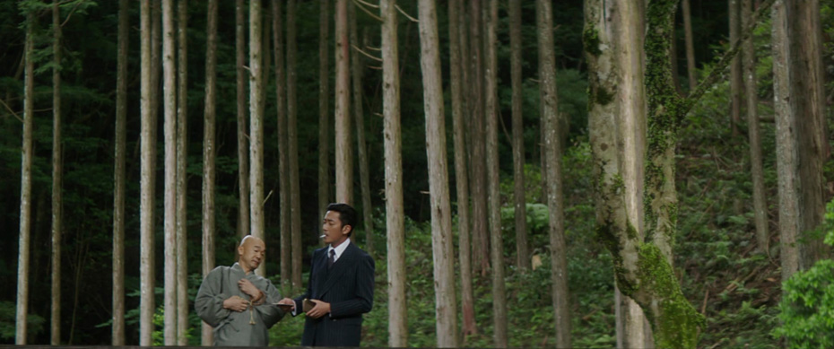
For THE HANDMAIDEN, Park and Chung focused on a visual style that was always playing with perspective by seamlessly moving between feelings of sensuality and danger. They scrapped initial plans to shoot the film in 3D with various depths of field for each section of the movie, feeling like the technique would ultimately be a distraction. Park and Chung focussed their efforts on telling a feminist, forward-thinking period piece with the trappings of a thriller genre mixed with dark comedy and eroticism, trusting the characters and narrative to bring the audiences through the shifting points-of-view without needing to impose that with the camera.
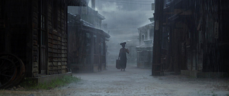
Chung shot The Handmaiden on the Arri Alexa, using vintage lenses to try to recreate the atmosphere of the period in which the story takes place. He also worked closely with colorist Park Jin-Ho, who took two weeks to grade the film. Chung and Park wanted the color grade to reflect the wet and muggy environments that the characters occupied throughout the film. Park Jin-Ho would often have CG clouds and rain added to scenes, and then both desaturate the frame and replace warmer colors with blues and whites to give the film its colder, more threatening visual style.
Not many Director-DP pairings have created a body of work as varied and idiosyncratic as Park Chan-wook and Chung Chung-hoon. Their six films are all indelibly unique, while retaining their distinct signature. By approaching each film from the perspective of understanding the characters visually, and then planning carefully to inspire freedom on set, Park and Chung have developed a collaborative style that has inspired filmmakers around the world, and built a body of work that is among the most important and recognizable of the 21st century.

